
Several ways into contemporary art in Daegu
DIAF 2026 runs from October 29 to November 1 in Halls 4, 5 and 6 of EXCO’s East Wing in Daegu. The nineteenth Daegu International Art Fair brings together 103 galleries from Korea and abroad. The first date, October 29, is a VIP and press preview; public admission runs from October 30 to November 1. Distinguish the first date on the poster from the dates your ticket allows. October 30 and 31 are listed as 11:00–19:30, while the final day, November 1, runs from 11:00 to 18:00. A Sunday visit therefore needs to account for a shorter viewing day than the preceding two.
A useful key to the fair is not how many famous artists you can name, but how you read different choices within one space. Each gallery selects and arranges works differently, while four special exhibitions pose separate questions about international exchange, everyday objects, private collections and a first acquisition. You can compare those approaches without planning to buy anything. For international visitors unfamiliar with Korean contemporary art, materials, scale, repeated lines or a figure’s expression offer visible starting points. Rather than moving quickly through the entire venue, a visit can connect a few works in greater depth.
A city’s art history meets its galleries today
Thinking of Daegu only as an alternative to Seoul can obscure the city’s own artistic context. The Daegu Contemporary Art Festival, which began in 1974 and continued through 1979, was an important meeting place for local artists and experimental practices from across Korea. That historical festival and today’s DIAF should not be treated as the same event or an unchanged organization. The earlier history nevertheless helps explain a background of discussing new expression in Daegu. A city’s art environment consists of more than public museum exhibitions: galleries introducing work, collectors preserving and showing it, and audiences returning to exhibitions all contribute.
This year’s participants include Dongwon Gallery, Leeahn Gallery, Gallery Shilla, Gallery C&K, Gallery J.One and 021 Gallery, alongside galleries from other regions. Lee Kang-So, Lee Kun-Yong and Nam Tchun-Mo on Leeahn’s artist list; Park Seo-Bo, Sung Neung Kyung and Kim Yong-Ik at Gallery Shilla; and Kim Tschang-Yeul, Chun Kwang Young and Kwun Sun-Cheol at Gallery J.One show that a booth need not be confined to one period or style. Instead of memorizing every name, choose an artist who interests you and look at the other work in the same booth. A familiar artist can become a reference point for asking why a gallery places particular practices together. The booth itself becomes an edited proposal.
Read the East Wing through scale and distance
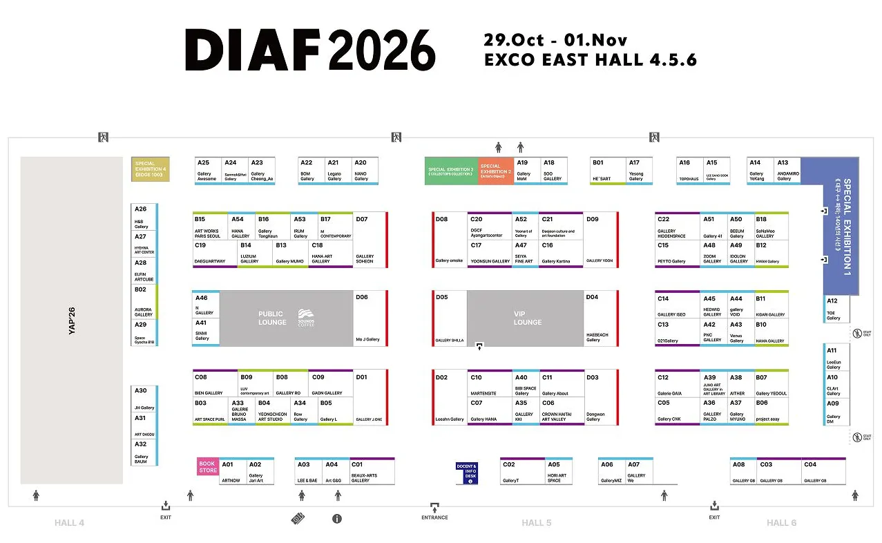
The venue is EXCO East Wing, Halls 4–6, at 10 EXCO-ro, Buk-gu, Daegu. This is different from the organizer’s office address on Dongdeok-ro in Jung-gu shown at the bottom of the official website, so enter the correct destination when traveling. On arrival, connect the entrance, special exhibitions and selected galleries on the floor plan. Record booth numbers beside unfamiliar gallery names to make returning easier. You need not walk all three halls at the same speed: one area can receive close attention before a broader look elsewhere. Distinguishing time spent moving from time spent looking makes the route less hurried.
The fair introduces exhibition partitions 3.6 meters high this year. Higher walls expand possibilities for larger works, but a work’s impression is not determined by wall height alone. Step back to see the balance of the whole image, then look more closely at paint or paper to find different information. Small paintings can be overlooked beside larger ones, yet the density of their spaces and brushwork is not proportional to size. With sculpture or objects, consider their sides and relationship to the floor within the permitted viewing area. A modest change of position can reveal shadows and empty space without entering behind a work.
Read repeated lines horizontally and vertically
Park Seo-Bo and Lee Ufan offer starting points for comparing line and surface in Korean contemporary art. Park’s Écriture varies with period and material: early pencil movements pass through wet paint, while later work reveals ridges in hanji, Korean paper. Lee’s From Line suggests a relationship between the diminishing paint in a brushstroke and the unpainted ground. Repetition can thus reveal the time of an action and a material’s response, rather than simple duplication. Keep that background in mind, but begin at the booth with the actual work’s title, date and medium. These references do not mean that particular works in museum collections are exhibited here; they provide a language for comparing lines in different practices.
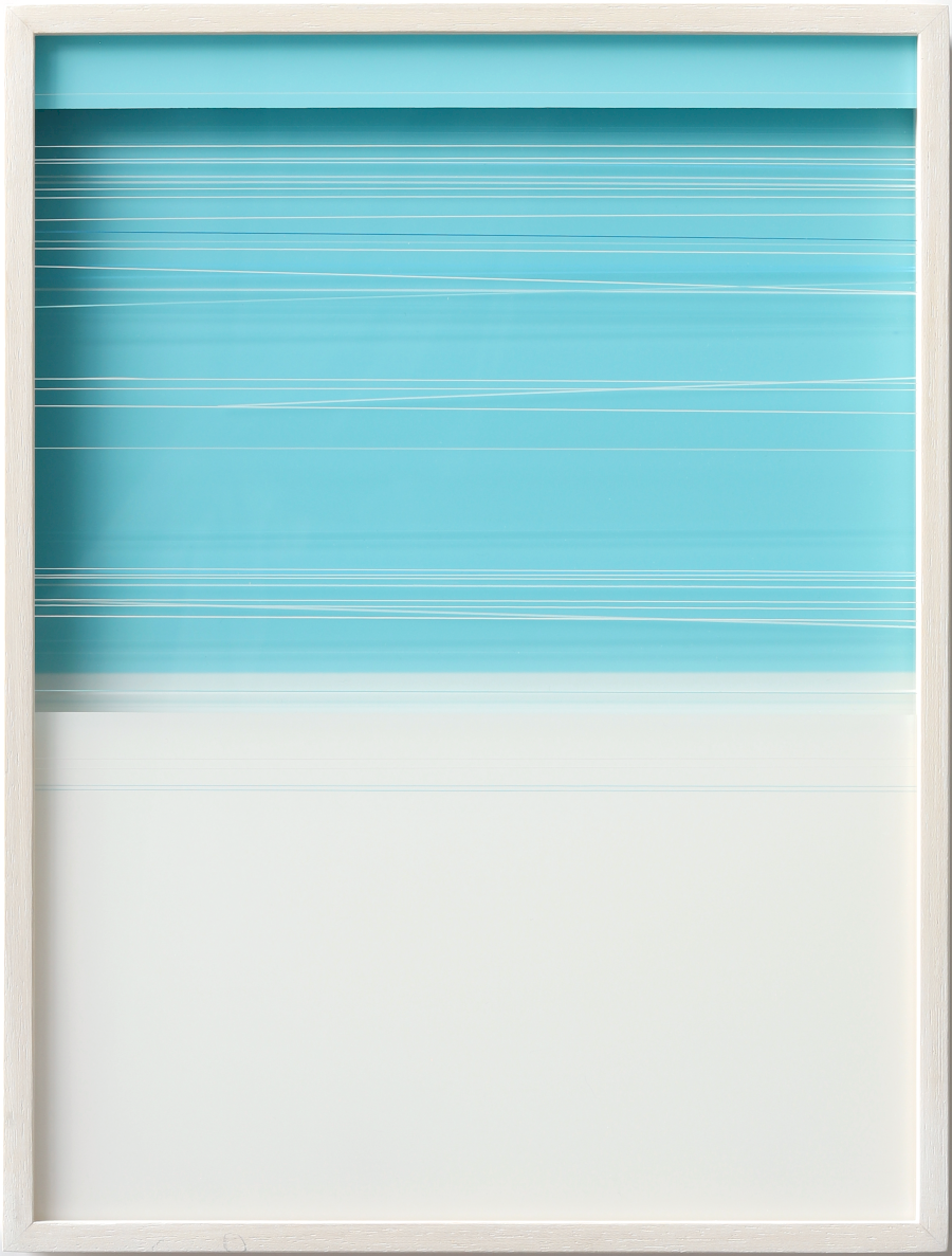
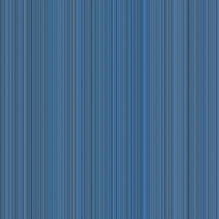
The comparison becomes concrete in Gallery Shilla’s presentation of Moon-Pil Shim’s R25010 (2025) and Sang-Yuel Yoon’s A little brighter A little darker (CSQ-2) (2023). In Shim’s image, fine white lines cross a turquoise area, gathering and spreading apart before a broad light area opens below. Yoon’s dense blue vertical lines fill a square, creating a rhythm of lighter and darker tones. One guides attention through intervals and open space between horizontal lines; the other through tonal changes in closely packed verticals. Even with repeated lines in both, does your eye travel sideways or follow an upward and downward movement? Compare the regularities and differences visible in these images with the actual works’ scale and surface when viewing them.
Kim Tschang-Yeul’s water drops and the pleasure of materials
Kim Tschang-Yeul is widely known for water-drop paintings, but recalling only one familiar image can narrow the range of his practice. His water-drop work, developed from 1972, uses grounds including newspaper, hemp cloth and wooden panels as well as canvas, with writing also appearing. A seemingly clear bead, a trace that appears to run or soak into a surface, and the characters or empty space behind it create different relationships. Do not stop at the illusion of actual water. Ask why the drop is placed on that particular ground. The meeting between a written stroke and a bright part of the drop offers another point of attention.
If you find Kim on a participating gallery’s list, such as Gallery J.One’s, check the work’s year and support against the image you already know. Changes in size, density and background can alter the pace of looking, even with the same water-drop motif. These questions extend to other artists. When paper is visible, is it a support or part of the image? With a raised surface, does its shadow participate in the work? Medium labels are more than unfamiliar technical vocabulary: they help explain how a visible effect was made. Looking again after asking a question can bring small choices into focus.
Daegu and Paris: 140 years of perspectives
The special exhibition Daegu-Paris: 140 Years of Perspectives begins with the 140th anniversary in 2026 of diplomatic relations established between Korea and France in 1886. It brings together artists from Daegu and Gyeongbuk who studied or worked in France and French artists with particular connections to Korea. The Korean participants are Kwak Soo Young, Kwun Sun-Cheol, Kim Jong Bok, Nam Kwan, Park Jong Kyu, Chang Seo Park, Byun Chong-Ha, Moon-Pil Shim, Lee Bae, Seulgi Lee, Chong Jaekyoo and Hwang HoSup. The coexistence of different generations and practices matters: passing through France does not lead every artist toward the same form of painting.
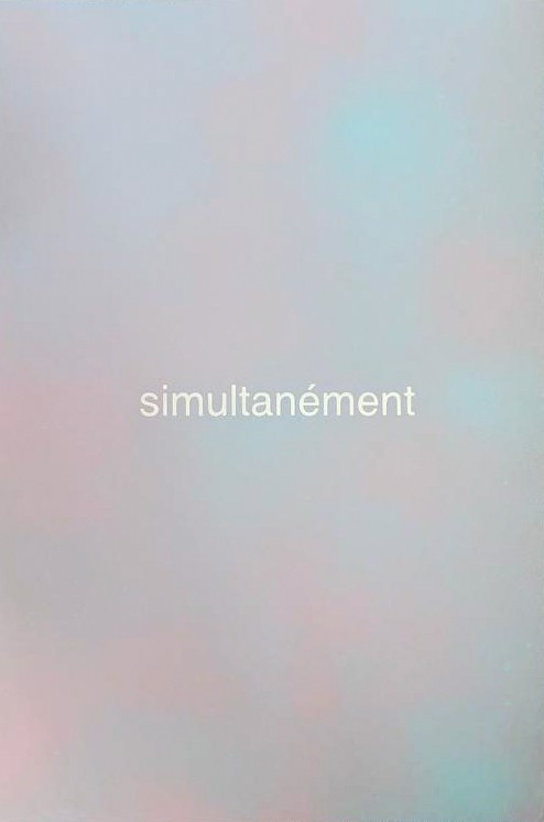
Chang Seo Park’s From Your Memory (2023), presented by Gallery Shilla, gives a concrete starting point for considering movement and expression. The French word simultanément, meaning ‘simultaneously,’ appears in the center of a softly blurred field of gray-blue and pinkish color. Alternating between the clearly readable word and the indistinct color boundaries invites a question about the relationship between memory in the title and simultaneity in the image. This is one way of reading the work, rather than a definitive statement of the artist’s intention. Where someone studied and what they made are connected, but are not identical information. Looking first at form or language, then reading the background and returning to the image, brings international exchange into the experience of looking, beyond the place names in a biography.
Repetition among the French artists is not one language
The French participants are Bernard Aubertin, Daniel Buren, Nicolas Chardon, Claude Viallat, Niele Toroni and François Ristori. One starting point for Buren is his alternating white and colored vertical stripes. The bands, approximately 8.7 centimeters wide and used since the 1960s, have been understood as a visual tool for noticing a work’s location and surroundings, rather than only as decoration. Look not just at a stripe but at the edge of a wall, the distance to another work and the relationship with the exhibition space. The setting of a form can become part of what is seen.
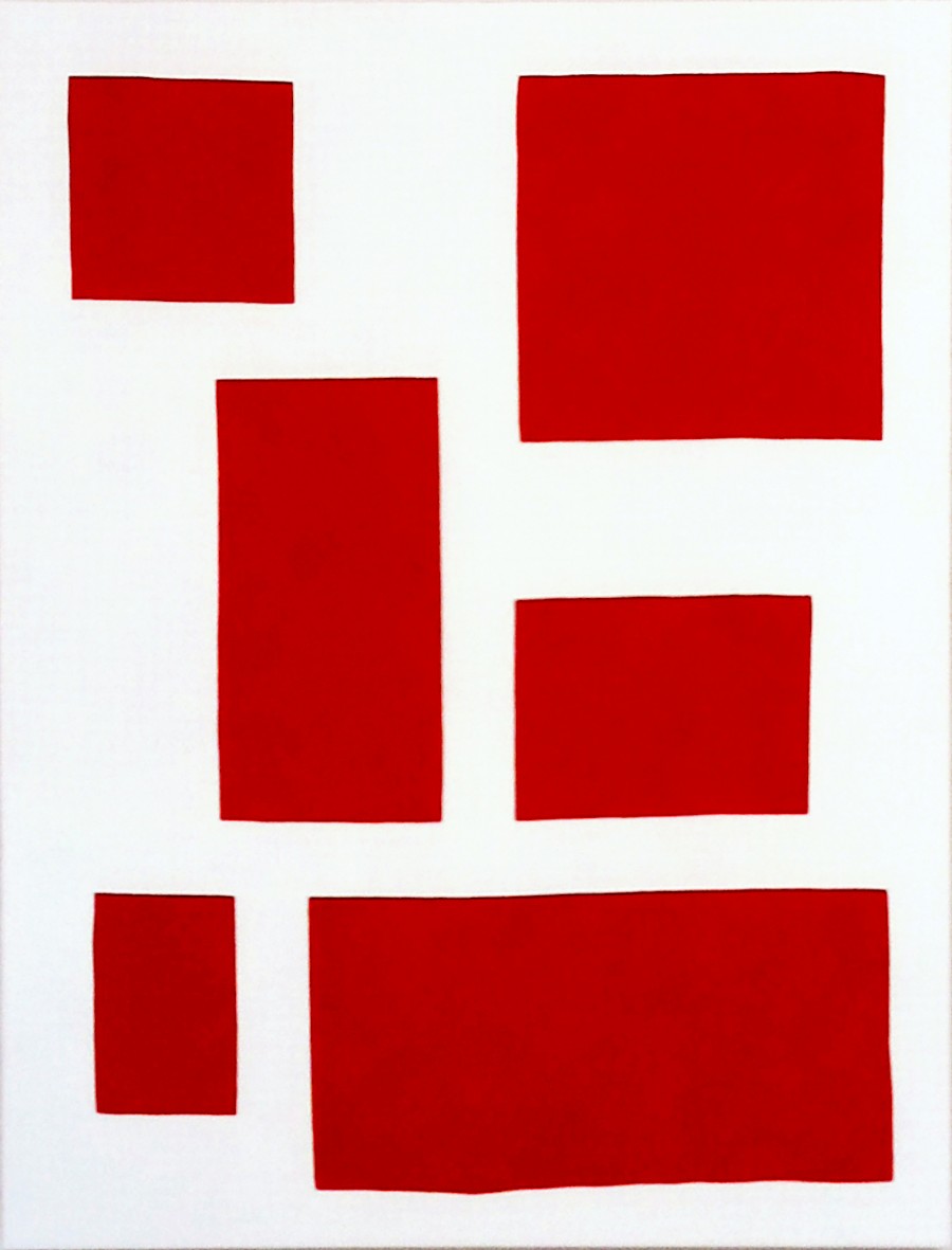
Nicolas Chardon’s Scenario Rouge (2018), shown in Gallery Shilla’s presentation, places six red quadrilaterals on a white ground. A small and a large shape near the top, vertical and horizontal forms through the middle, and a small area beside a long one below establish changes in size and direction. The red is shared, yet the white intervals around each shape give it a different visual weight. The edges are not perfectly identical as in a diagram, inviting attention to both regularity and slight deviation. After thinking about Buren’s stripes, this image suggests a comparison between repeated elements in relation to an exhibition space and their arrangement within a picture. That does not assign one method to all six French artists: reading actual materials and compositions reveals differences within the exhibition’s shared framework.
Donald Judd’s furniture: function alongside proportion
The Artist’s Objects centers on Donald Judd’s furniture and objects to explore where art, design, architecture and living space meet. Treating simple forms as sculptures merely converted into furniture misses an important distinction. Judd explained that furniture must function, and that the configuration and scale of art cannot simply be transferred into furniture. A chair or table can therefore be considered through bodily proportion, support and the meeting of materials, not just through its outline. The exhibition invites questions about visual form and the actual purpose of an object at the same time.
Objects composed of straight lines and planes may initially seem straightforward, but thickness, height and the proportions of empty space can transform their impression. Looking at the gaps between an object, the floor and the wall suggests how furniture relates to other things in a room. Considering function does not mean sitting on or touching an exhibit without permission. Observe its structure from the viewing area and ask staff about materials and production. The year a design was conceived and the date an individual piece was made are also distinct information. Visitors interested in architecture or design can treat this exhibition as a main route through the fair, rather than a pause between paintings.
A collector’s choices: Warhol beside Kusama
A Collector’s Collection presents works by Andy Warhol, Yayoi Kusama, Alex Katz and Cy Twombly through the perspective of one collection. The question is not simply that four different names have been assembled, but which works were chosen together. Warhol brought images of popular culture and consumer society into art, while Kusama has explored a sense of infinity through repetition and proliferation. Familiar images may come to mind first, but at the exhibition establish whether the work in front of you is a painting or print, when it was made and with what materials. One artist’s name can encompass different forms and viewing experiences.
Alex Katz and Cy Twombly, also included, offer another comparison of painted surfaces. With Katz’s figures and landscapes, move beyond recognizing the subject to notice where a contour is simplified and how a face or landscape is separated from its ground. Twombly’s handwriting-like lines and traces can be followed through overlaps, speed and pauses, even without becoming a readily legible sentence. They open different questions: what is depicted, and how is something left on the surface? With Warhol and Kusama, ask what is repeated and how colors or intervals change between instances of an image. Rather than read the four names in order of fame or price, consider how the memory of one work affects the next. A collection is both a sum of individual works and an arrangement that makes them newly visible in relation to one another.
Two forests: repeated trees and the depth of looking
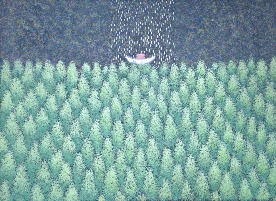
In Gallery T’s presentation, Seonmi Kang’s Anon-ui Sup (2026), a title suggesting a peaceful forest, fills the image with densely grouped light-green trees. A small form appears above the forest near the upper center, with short bright marks extending above it. The trees first gather into a broad field; noticing that small form moves attention from the whole to a particular point. Compare the feeling created by reading the title with the impression of the image alone. Changes of brightness and gaps between trees keep the greens from becoming one undifferentiated mass. Rather than stop at the category of nature painting, consider how repeated forms establish a focus. Questions about line and interval that began with abstraction can continue here.
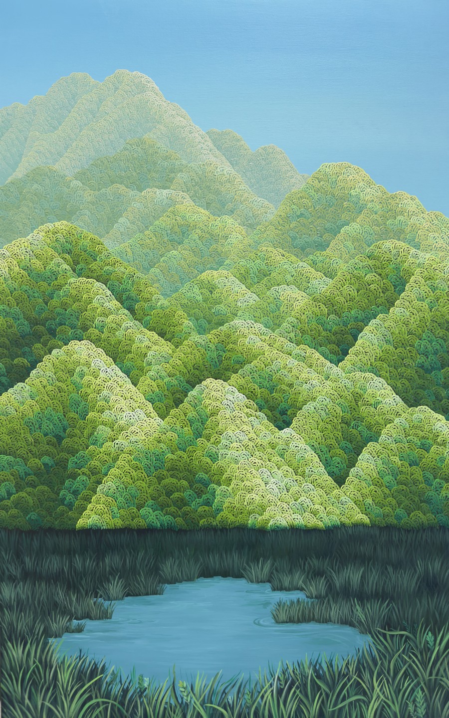
Wondeuk Cho’s Marsh and Ridge (2026) places water and reeds in the foreground, overlapping green ridges in the middle and blue sky above within a tall image. Small curved forms recur inside the ridges, while light and dark colors and overlapping hills separate nearer from farther areas. After finding a small form in Kang’s forest, follow how your eye travels from Cho’s water through the ridges to the sky. Both use extensive green, yet the packed forest and the landscape receding in layers create different senses of space. This comparison begins with the compositions visible in the images; in front of the works, scale and surface can add further information. Two artists choosing related subjects need not offer the same way of seeing.
Edge 100: small works and a first acquisition
Edge 100 centers on gallery-recommended works priced at no more than KRW 1 million and, for flat works, no larger than Korean size 15. The name should not be read as a promise of exactly one hundred works, nor does size 15 mean a width or height of 15 centimeters. It is a painting-format designation, so ask for actual dimensions and the framed size separately. A small work need not be merely a cheaper substitute for a large one: it offers a chance to see how an artist concentrates color and form within a limited surface. The combined price and size criteria are this exhibition’s specific starting point.
For a first acquisition, imagine the intended wall, its light and the distance from which you would look. The work’s dimensions and its framed dimensions may allow different placements. Ask for the title, year, materials, whether it is a unique work or an edition, and the conditions covering framing and delivery. Provenance and artist information are also records to retain with the work. There is no need to interpret the exhibition’s price threshold as a promise of financial return. Being able to explain why you would want to keep looking at a work is a useful starting point. Time spent comparing without buying also helps develop taste.
Read ticket prices together with access
The official press information lists general admission at KRW 20,000, youth and university student admission at KRW 10,000, and VIP admission at KRW 100,000. Public ticket dates are October 30–November 1. The VIP ticket separately describes one accompanying guest, access throughout the fair period, a VIP lounge and drinks, and a limited docent program. The difference is therefore connected to the scope of access, not simply a higher price for the same visit. Decide your date, companions and programs you actually intend to use before comparing options. A preview that has already passed should not confuse plans for the remaining public days.
Online purchase leads through the official site to a Ticketlink product. Read the booking conditions for discount ages and evidence, reentry, exchanges and cancellation. Seeing several eligible public dates in a ticket introduction should not be taken to guarantee unlimited repeat entry on one ticket. International visitors should prepare any required proof of eligibility or identification in a form they can actually present. Event enquiries are directed to the organizing office at +82 53 421 4774. Settling the date and relevant ticket conditions in advance preserves more time for looking once you arrive.
Begin with a docent, then return at your own pace
Public docent tours are listed at 11:30, 13:30, 15:30 and 17:30 on both October 30 and 31. November 1 has three sessions, at 11:30, 13:30 and 15:30. Planning around a tour requires time for ticket checks and finding the meeting point as well as reaching the venue. The program focuses on representative artists and major works from participating galleries through three themes: currents in Korean contemporary art, sharing new experiences through art, and the expansion of art. If an unfamiliar work leaves you unsure where to begin, an introduction can provide several useful reference points.
Afterward, leave time to revisit two or three works that stayed with you. During a tour you may learn about period and materials; on returning, find where that explanation connects with the actual image. Rather than memorize everything, note the artist, booth number and one feature you have newly understood. Languages, session capacity, registration and meeting points need separate confirmation. A public docent program should not be assumed to operate in every language. When the available language does not suit you, labels and questions at individual booths can still help you establish your own pace of viewing.
Imagining a city through windows and a giant cat
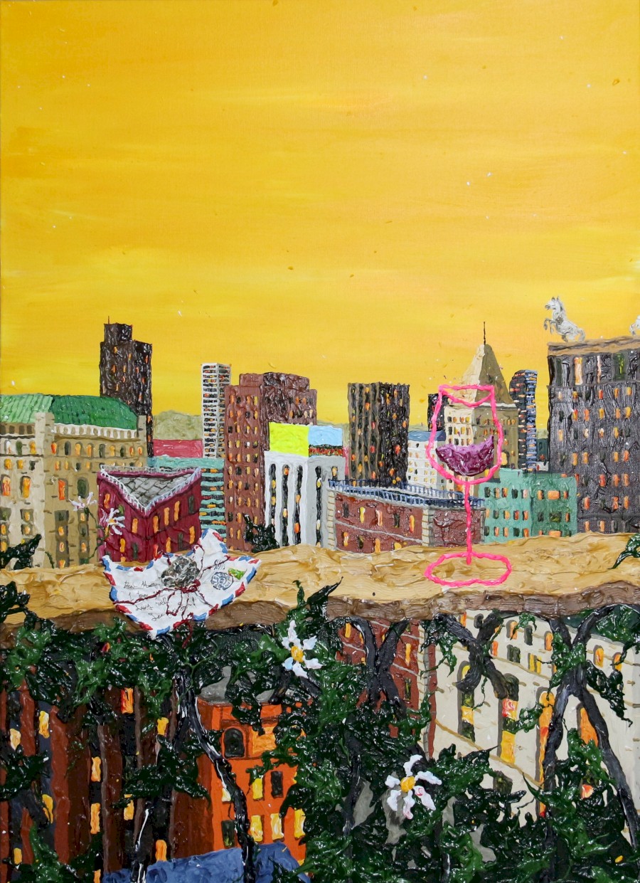
Woosol Kim’s A life behind every window (2026) spreads buildings and windows beneath a yellow sky, with a flower-entwined railing and a vivid pink wineglass in the foreground. Notice how a distant city and nearby objects meet within one image. Looking at individual windows reveals different rhythms among the buildings; stepping back makes the yellow sky gather that complexity together. The title suggests lives behind windows, without requiring us to identify a specific real city. The visibly pronounced paint surface and the relative sizes of objects invite more than a straightforward factual reading of space. Compared with the forests, repeated windows rather than trees now establish the image’s density.
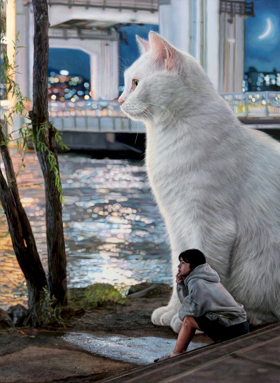
In Woojae Jeong’s Radiant-Alongside (2026), a girl sits by the water beside an enormous white cat. The fur and surrounding light are detailed, yet a body much larger than the person changes ordinary expectations of scale. Notice reflected lights, the bridge behind and the narrow moon, then the closeness of the two figures: the title’s sense of being alongside becomes a visual question. Rather than settle on one definite story, consider the feeling created when a familiar place meets an unreal proportion. Kim and Jeong both use elements of a city while leaving room for imagination in different ways. Record the artists and titles and check photography permissions, so that returning to the electronic catalog can extend the differences you noticed.
The art tour bus from Dongdaegu and museum connections
During the fair, the art tour bus is described as a loop from Dongdaegu Station to EXCO, back to Dongdaegu, onward to Daegu Art Museum and Daegu Kansong Art Museum, then back to Dongdaegu. DIAF ticket holders can use it free without a limit on journeys during the event. The press timetable lists EXCO-bound departures from Dongdaegu at 10:30, 13:00, 15:00 and 17:00, with EXCO times of 10:50, 13:20, 15:20 and 17:20. Allow time to move through the station and find the actual boarding point rather than assuming an immediate connection from the train. This is a scheduled service, not a subway-like frequency.
The subsequent museum-bound Dongdaegu times are 11:10, 13:40, 15:40 and 17:40; the museum stop is listed at 11:40, 14:10, 16:10 and 18:10. Final returns to Dongdaegu are 12:10, 14:40, 16:40 and 18:40. Treat these as the planned timetable, verify the boarding point and day’s conditions, and allow for full buses or traffic. Free bus travel is not the same benefit as admission to the connected museums. Check each exhibition’s hours and ticket conditions before combining visits. Taking a late bus to a museum does not by itself mean there will still be time to enter its galleries.
Carry a personal art map beyond the fair
After the visit, remember the gallery that introduced a work as well as the artist. You can then follow how an impression formed in one booth changes in a later exhibition. Revisit the catalog around a material or approach you enjoyed, and look for official gallery programs or more work by the artist. A single day can become a starting point for another visit. The official online viewing room lets you revisit registered works by gallery, with images, artists, titles and years. Gallery Shilla’s lines and fields of color can be compared again with Gallery T’s forests and city images. A screen cannot replace every aspect of physical scale and surface, so notes made while looking give that record greater specificity.
What DIAF 2026 can leave you with is not only a checklist of works seen, but a few ways to read different kinds of art. The time within a line, the ground behind a water drop, furniture’s function and proportion, or relationships a collector creates between works can become questions for the next exhibition too. Before leaving, recall one work you wanted to keep looking at and one that changed your mind. A familiar name may have made you stop first, yet an unknown artist’s material or color may stay longer. Encountering Daegu’s galleries and special exhibitions together can expand that personal map of looking.
A little closer to Korea.
Thank you for reading.


