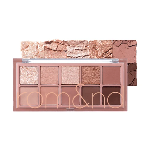
A ten-pan eyeshadow palette can look like a whole new personality in a shopping basket. In practice, the useful question is smaller: will you wear its middle shades on an ordinary Tuesday? rom&nd Better Than Palette makes that question interesting. Some versions are gentle collections of browns and pinks; others concentrate on grey shadows or conspicuous sparkle. Sharing a product name does not mean they do the same job.
For a first Korean eye palette, this range is worth considering when you want controlled colour rather than an immediately opaque block. It is less convincing as a blind purchase made from a flattering model photograph. This review compares the visible colour arrangements, published product guidance and users’ experiences. It is not a claim that our editor wore every shade, and the recommendations below depend on the particular palette, your skin tone and your preferred finish.
Start with the three pans that matter
Cover the most spectacular glitter in the product photograph with your finger. Then look for a base you could use, a middle colour you genuinely like, and a dark shade capable of defining your eyes. Those three pans tell you more about everyday usefulness than the total of ten. A palette containing several pale colours is not necessarily poor value, but it becomes poor value for you if they all disappear against your skin or produce the same effect.
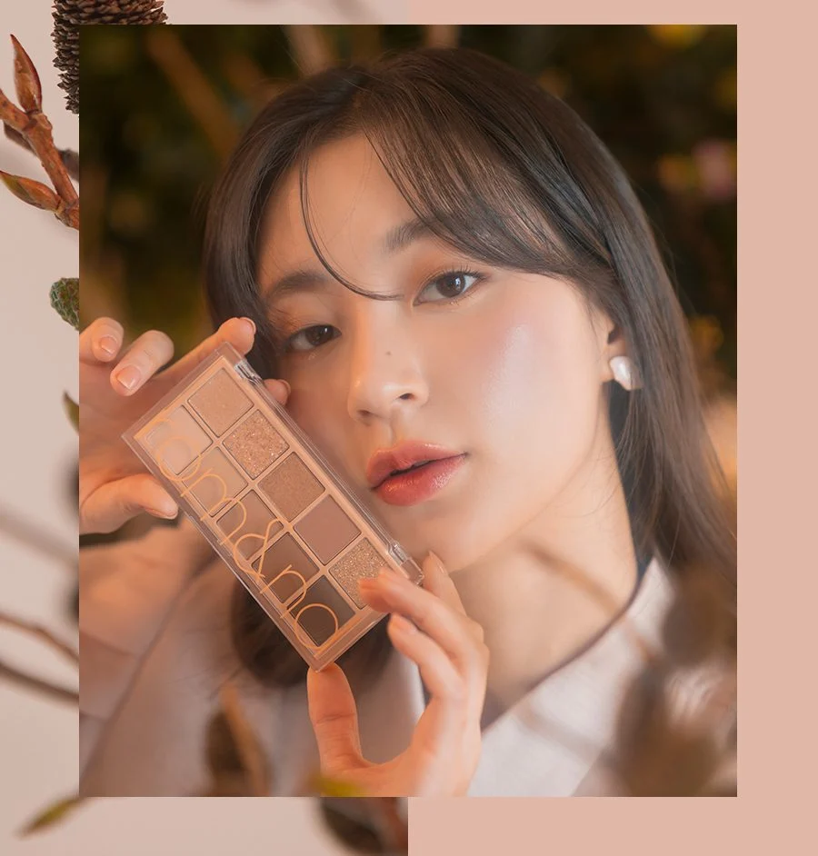
Warm coral and peach are the visual direction of 01 Pampas Garden. It makes more sense alongside peach blush and warm lip colours than as an attempt to create a distinctly grey eye. 02 Mahogany Garden shifts the emphasis toward copper and deeper browns. That extra depth can be useful when you want the lash line to remain visible in an evening photograph, though the warmer shades will not suit every idea of a neutral brown.
Pink, shadow or pure sparkle?
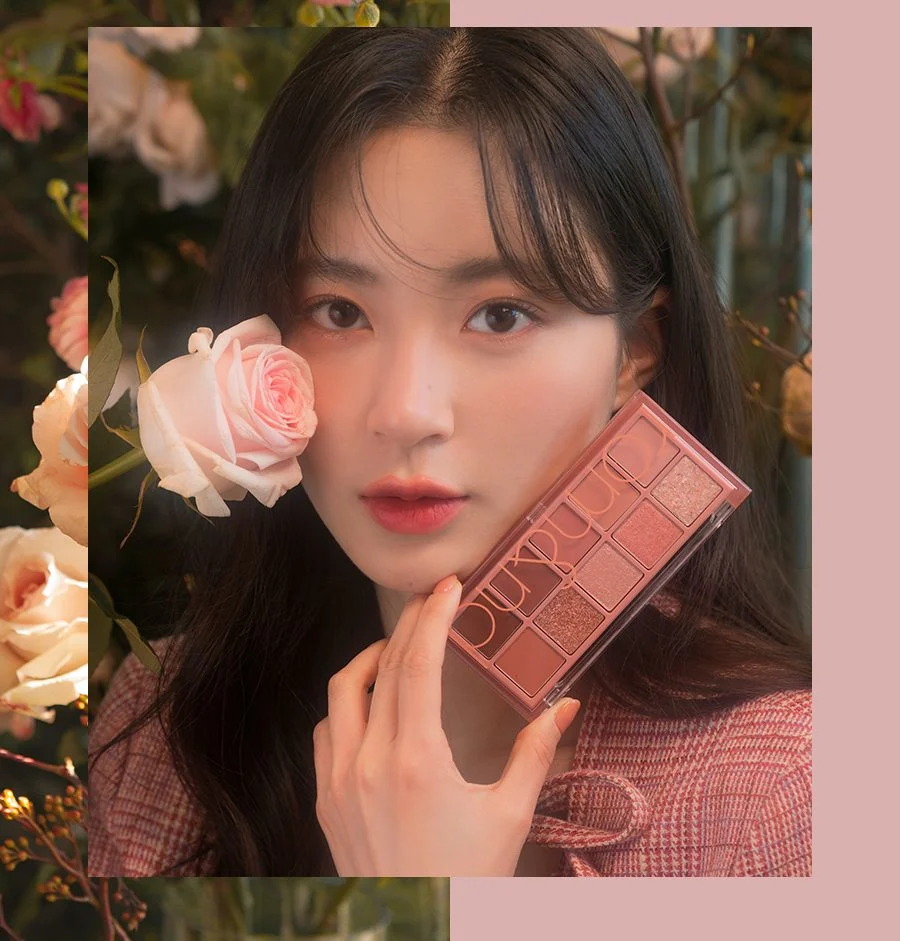
03 Rosebud Garden is the option to inspect if your favourite looks involve soft pink, rose and mauve. Do not buy it solely because a seasonal colour label calls it cool. Pink can look muted, brownish or surprisingly bright depending on the skin beneath it, surrounding blush and lighting. Compare the middle shades against a pink product you already enjoy, rather than expecting a screen to settle your undertone.
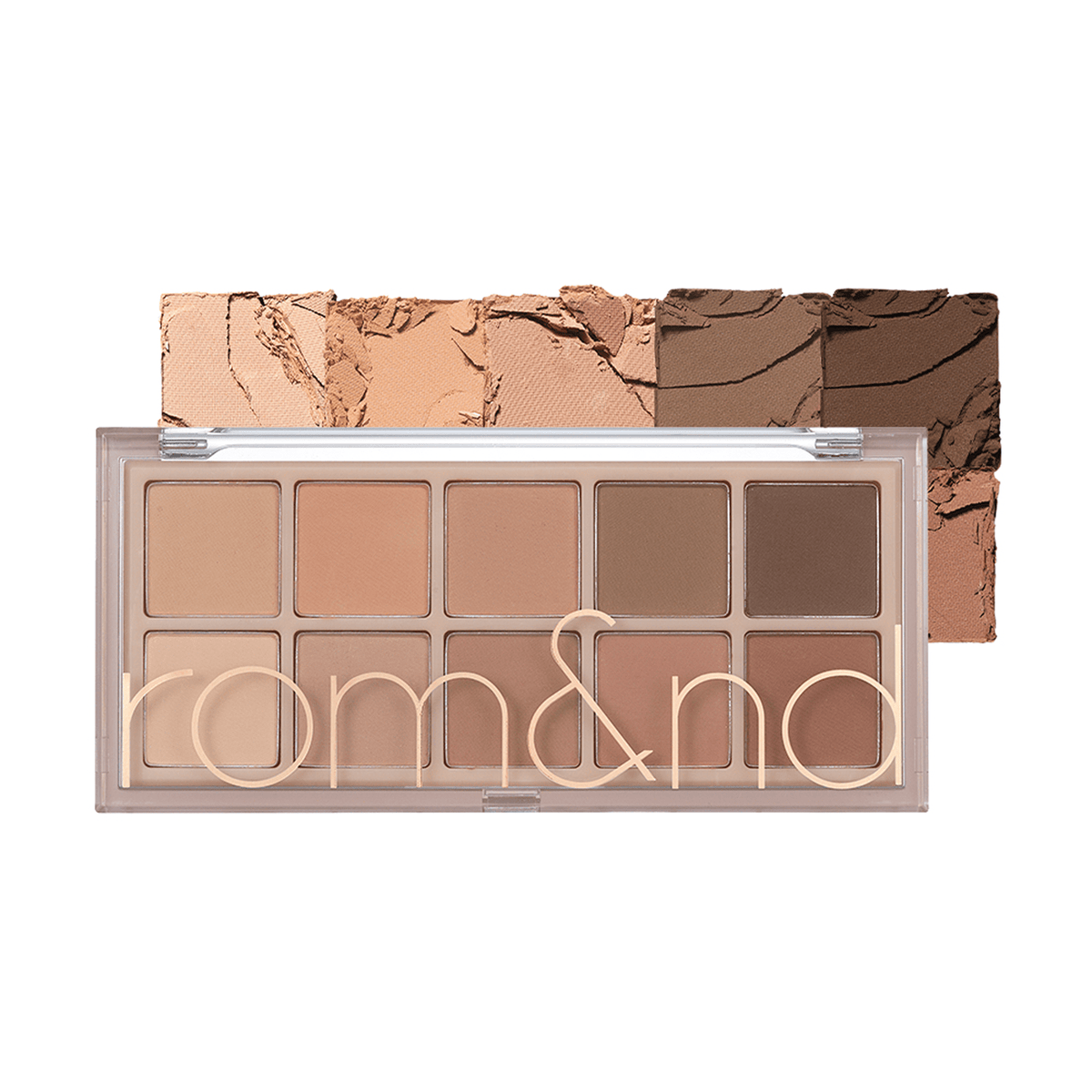
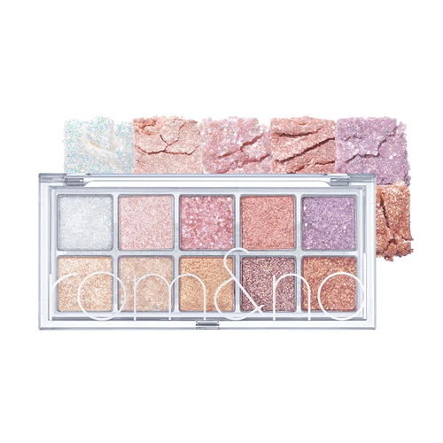
05 Shade & Shadow Garden is the straightforward alternative for someone who rarely wears glitter: its all-matte arrangement prioritises shading. By contrast, 00 Light & Glitter Garden is a collection of sparkling finishes. It can complement a matte palette you already own, but it does not replace one for building a fully matte everyday look. 07 Berry Fuchsia Garden deserves separate consideration if you want stronger berry and plum colour. Choosing the format first prevents paying for textures you will continually skip.
What the photographs cannot decide for you
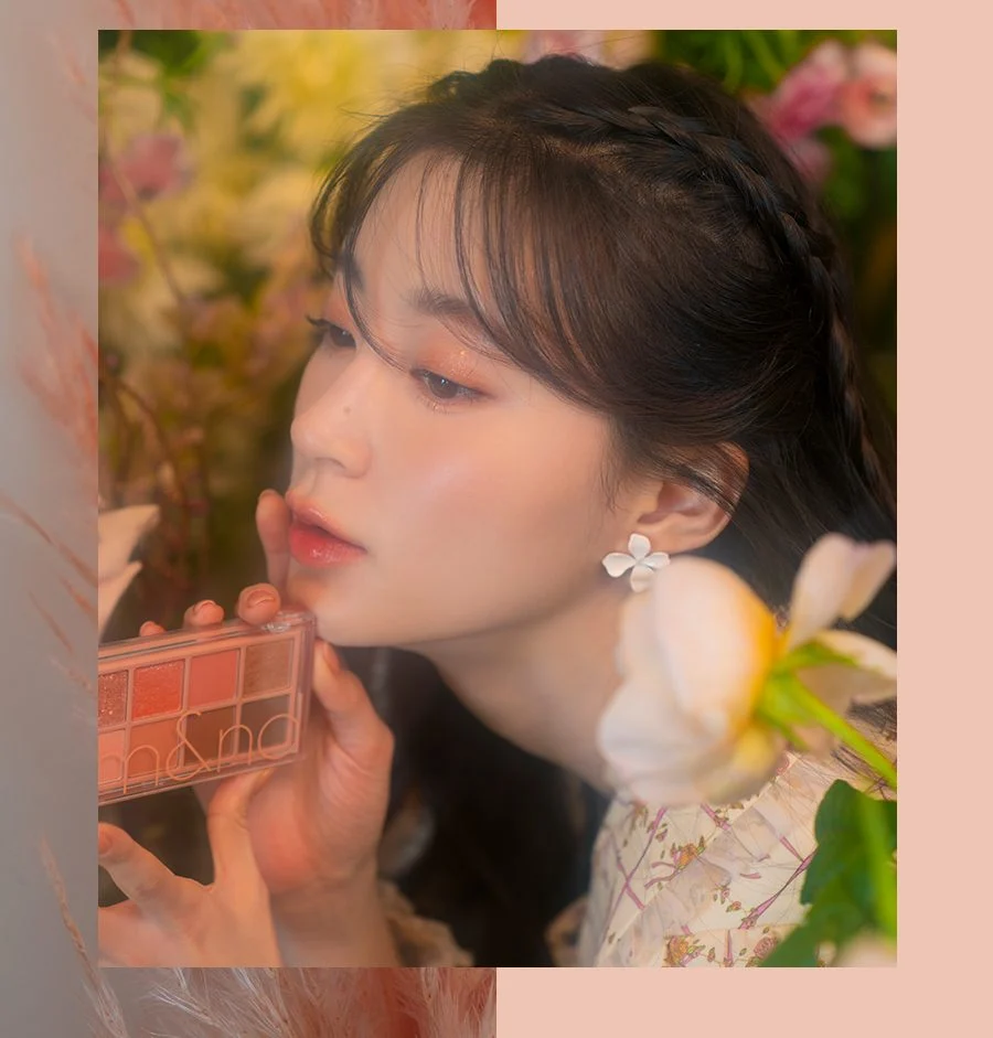
An arm swatch is a useful colour map, not a promise about a finished eye. A dense swipe on flat skin, a softly loaded brush and a small amount pressed onto a moving eyelid are different applications. The official model images here help illustrate colour direction; their lighting and styling should not be read as a guarantee of pigment, texture or wear on your face. Look at more than one skin tone and notice whether a swatch was layered.
Real experiences are mixed in useful ways. Reports of easy blending and pleasing everyday colour sit alongside complaints about chalkiness or uneven application, including for Berry Fuchsia Garden. Those differences are a reason to distinguish shades and preferences, not to declare every positive or negative review wrong. Someone seeking a sheer wash and someone seeking dense, highly visible colour can judge the same result very differently. There is no measured wear test here from which to promise an all-day result.
Build one look before attempting ten shades
For a quick daytime combination, choose a matte close enough to your skin that it creates a gentle transition. Apply a small amount across the part of the lid you want to shade. Add one medium colour toward the outer portion, then use a smaller brush and a deeper shade close to the upper lashes. Keep the darkest colour within a narrow area at first. You can enlarge it after checking both eyes with your face relaxed.
A hooded or monolid eye does not need a crease drawn where a tutorial happens to put one. Keep your eyes open while deciding where the colour remains visible, then check the placement after each small addition. The aim is a readable shape, not copying another person’s eyelid anatomy. If the colours become indistinguishable, stop adding new shades. Blend the outer edge with a clean brush; more layers are not always the solution to a muddy result.
For an evening variation, deepen the existing outer section rather than covering the entire lid in the darkest pan. If you enjoy sparkle, add a small accent to the area permitted by the product’s own directions. This keeps the colour underneath visible. An all-matte version can still create an evening look through contrast; there is no requirement to use glitter simply because a photograph of Korean makeup includes it.
Handle texture without turning it into a struggle
Use light pressure when picking up powder. A brush loaded heavily enough to scatter product is harder to control, and pressing harder into a pan does not tell you whether the formula is good. Tap off excess over a tissue, apply a thin layer and assess it before repeating. A smaller brush can provide more precise placement; a clean, softer brush can blur only the edge. Keep those tasks separate when the colours start spreading too widely.
For glitter, read the directions and warnings on the particular item you have bought. Particle size and permitted placement matter. Keep loose particles away from the waterline and avoid using a shared store tester directly near your eyes. If a formula feels uncomfortable, do not force yourself to continue because a sparkling look photographs well. Remove makeup gently with an appropriate remover instead of scrubbing at the skin. These practical limits matter more than finishing every pan.
A better shopping test in Korea
If a store has a tester, first confirm the palette number on the tester and the sealed box. Similar-looking versions and limited packaging can make a rushed purchase surprisingly easy to get wrong. Inspect the colours in the light available, then move out of the most flattering spotlight to judge the swatch. Photograph the product label, not just a hand covered in colours, so you can remember which shade family you actually tested.
Compare the total price with how much of the palette you will use. Four useful pans in a compact you like can be better value than ten that mostly repeat what you own. Equally, a palette that supplies everyday mattes plus a few occasional accents may be convenient for a trip. Check the ingredients, warnings, seller and return conditions before paying. Availability, promotions and exact shade selections vary by country and shop; a review cannot guarantee a particular Seoul branch has your choice today.

Turn a tester into a useful decision
A simple comparison can make the selection less abstract. Choose one light, one medium and one deep matte from the same palette, and place them beside each other on your hand using separate clean applicators. Look first at whether the medium colour differs enough from the base; then ask whether the dark shade adds definition without changing the whole colour family. This is an editorial shopping exercise, not a laboratory test. A pleasing sequence on the hand still needs to be judged against the kind of eye makeup you actually wear.
Next compare a single light application with a deliberately built-up patch. Keep the amount and tool reasonably consistent between palettes. A shade that appears beautiful only after many layers may demand more time than you want in the morning. A shade that becomes intense quickly may require more restraint, which is not automatically a defect. Notice whether you like the colour at your normal viewing distance as well as close up; a magnified phone image can make a tiny sparkle seem like the main feature of a whole look.
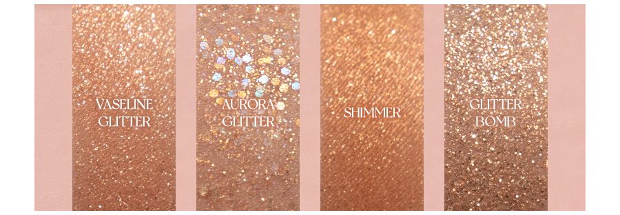
For shimmering shades, turn your hand slowly rather than judging one still frame. Decide whether you enjoy a soft sheen, distinct sparkling points or both. Those effects serve different preferences. You do not have to combine every finish in a single look. One matte colour and one small luminous accent can be a complete choice, while a matte-only arrangement can depend on placement and contrast instead of reflection. There is no bonus for using more pans.
Finally, compare your shortlist with what is already in your makeup bag. Identify the actual gap: a usable darker shade, a pink that does not duplicate your blush, or a glitter accent absent from your current collection. If the new palette mainly repeats what works already, keeping your existing routine is a reasonable result of the comparison. If you buy, protect the compact in your bag and keep applicators clean and dry. A thoughtful match is more useful than a larger collection.
Keep depth, undertone and finish as three separate questions. A dark shadow is not necessarily cool, a pale one is not necessarily neutral, and a shiny one is not automatically more visible once the light moves away. When a palette seems confusing, describe those three features separately before deciding you dislike the whole colour family. This also makes comparisons with your existing products clearer: you may need a different depth rather than another pink, or a different finish rather than an entirely new set of colours.
Who is likely to enjoy it?
Better Than Palette makes most sense for someone who likes arranging soft colour and does not mind building a look gradually. Rosebud Garden offers a clear starting point for pink-focused makeup; Pampas and Mahogany make different cases for warmth; Shade & Shadow suits a matte routine; Light & Glitter is an addition for sparkle lovers. These are different purchases, not interchangeable members of a collection you need to complete.
If you want very strong pigment immediately, have little patience for pale shades, or already own the same middle browns and pinks, compare alternatives before buying. The appealing part of this range is the possibility of a well-matched small colour wardrobe. Its limitation is that a beautiful arrangement on the shop shelf can still be the wrong wardrobe for you. Pick the palette whose ordinary shades earn their place, and let the spectacular pan be a bonus.
Reviews 8
Two gardens, different occasions
Public review · edited
Pampas Garden feels thoughtfully put together to me. The colours work as a set, although I do not reach for it as often as I should. The non-glitter shades suit my everyday makeup, and the pink glitter in the middle is especially lovely.
Light & Glitter Garden is my regular topper palette for special occasions, including Christmas, Tet, weddings and raves. I love it apart from one serious drawback in my experience: the large glitter particles are very painful if they get into my eyes.
chau-a-not-chau-bcdf · Reddit
Coral colour and noticeable glitter
Public review · edited
At first Pampas Garden reminded me so much of Peripera Better Carroting that I felt disappointed, but Pampas is more coral while the Peripera is more orange. I think my colouring is bright spring; Shade & Shadow Garden suits me least, and N21 is a little pale on me.
In my own comparison, rom&nd picks up more readily and feels powderier than Peripera, so it can be messier with a brush. I usually apply with my fingers, which makes that less bothersome. Its glitter is quite large and dramatic for my taste, so I rarely use it.
shuhsu · Reddit
Berry Fuchsia did not impress me
Public review · edited
I prefer stronger pigment and enjoy both neutral and colourful combinations. Better Than Palette 07 Berry Fuchsia Garden did not work especially well for me: I found it chalky and uneven. I liked the shimmer formula in rom&nd’s separate INAPSQUARE Glitz in Black quad more, although a shimmer-only quad has fewer uses.
alleriaswiftwind · Reddit
Dusty Fog: visible colour without endless layering
Public review · edited
I used Dusty Grey high in the crease, Taupe Brown lower down to deepen it, and Soft Black at the inner corners. Taupe Brown also went along the lower lashes. I do not always wear neutrals, but sometimes enjoy cooler grey tones.
Dusty Fog Garden looks much more pigmented to me than my Clio palette. It is not as intense as some Western indie shadows I own, but I can actually see the colour without building many barely visible layers. It blends fairly easily, and I would consider other colour combinations.
solskinnratel · Reddit
My comparison depends on what I enjoy
Public review · edited
I own Better Than Palette 11 Cheeky Cheeky Garden among several brands. In my comparison its pigment sits below Flower Knows and Clio but above Wakemake, Dasique and rom&nd Bare Layer. For blending and softness, I place rom&nd lower than the other palettes I compared.
These rankings reflect my own taste: I use Flower Knows more because I prefer its colour stories and packaging. Prices are also personal to where I live and the sales I watch, not a universal ranking for every shopper.
magicteacupfrog · Reddit
Rosebud Garden for rosy pink
Public review · edited
My undertone is neutral, leaning a little warm. I would recommend 03 Rosebud Garden if you love rosy pink. I find it versatile, especially for my aegyo-sal makeup, and I really like the colours.
baebae02 · Reddit
Mahogany in regular use
Public review · edited
I have light olive skin with a neutral-to-warm undertone, and I use 02 Mahogany Garden a lot.
imprecationstation · Reddit
Dusty Fog has a learning curve
Public review · edited
I usually wear shade 21 in Korean foundations and my skin leans yellow. The mattes feel soft and finely milled, with good colour and easy blending, but some softer shades kick up powder and fall out. Dusty Grey is one example.
The upper row feels like familiar cool neutrals; the lower row is much more distinctly grey than many brown-grey palettes I have seen. Soft Black works well as a liner shade with the other colours. I love the palette, but these greys can take practice if they are unfamiliar. I use a light hand, especially with the bottom row.
[deleted] · Reddit
A little closer to Korea.
Thank you for reading.